techniques
Van Gogh Colour Contrast
What colour contrast does in two paintings
The Night Cafe: red and green unsettle the room
In a September 1888 letter, Van Gogh describes contrasting pink, blood-red and wine-red with several greens to convey the unsettling atmosphere of The Night Cafe. Red against green is not merely a colour-wheel exercise here: the clash serves a particular interior and the feeling he wanted it to carry.
Starry Night over the Rhone: cool water, warm lamplight
For Starry Night over the Rhone, Van Gogh describes a green-blue sky, royal-blue water and a blue-violet town, set against yellow gaslight and reflections running from red-gold to green-bronze. The cool expanse and warm lamps work against each other; that does not make blue and yellow a strict complementary pair. The contrast serves a different purpose from the charged interior of The Night Cafe.
Long-tail intents
- Van Gogh colour theory
- Van Gogh complementary colors
- Van Gogh palette analysis
Creative Context
Representative Artworks
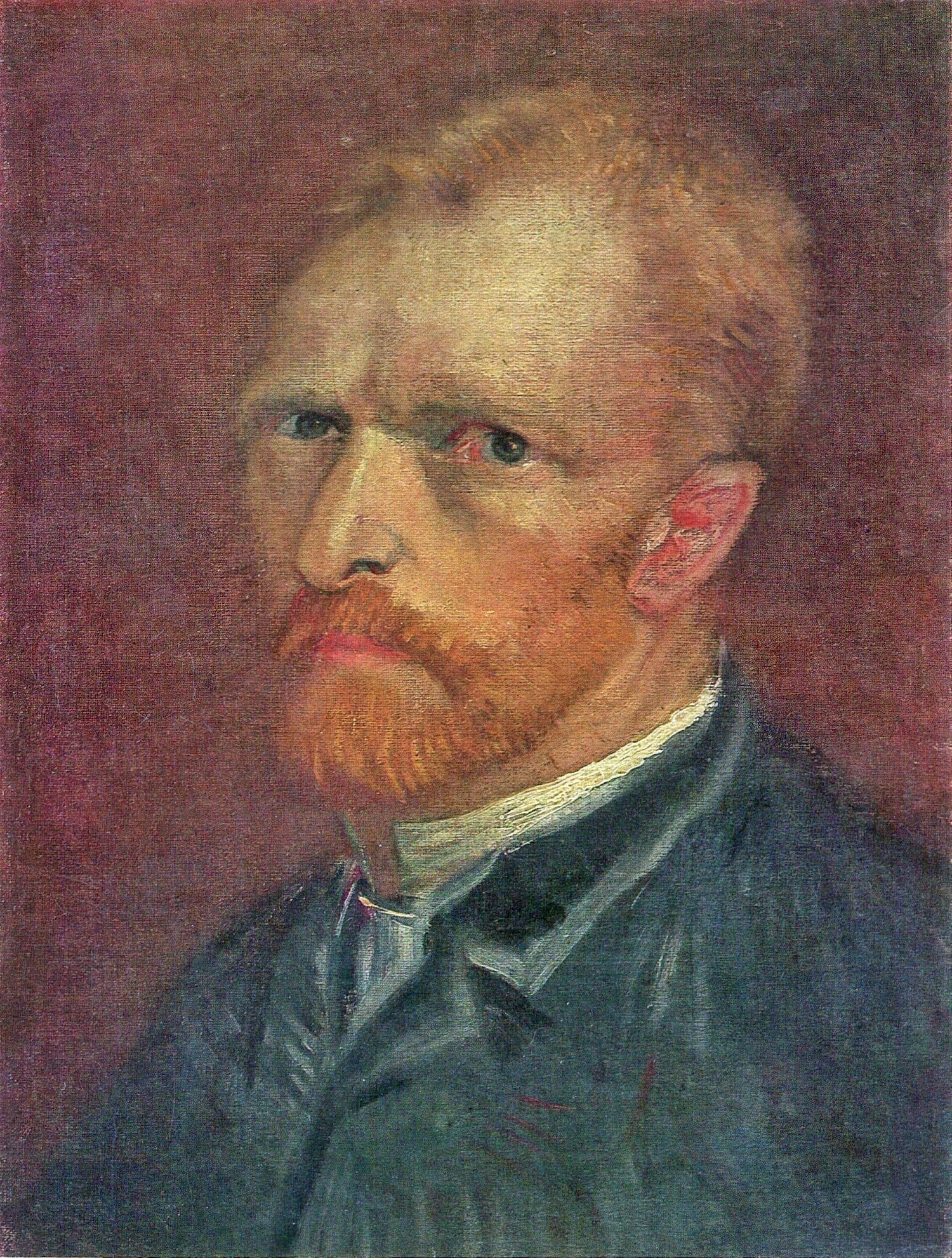
Self-Portrait (Paris, dark) 1886 · F178v 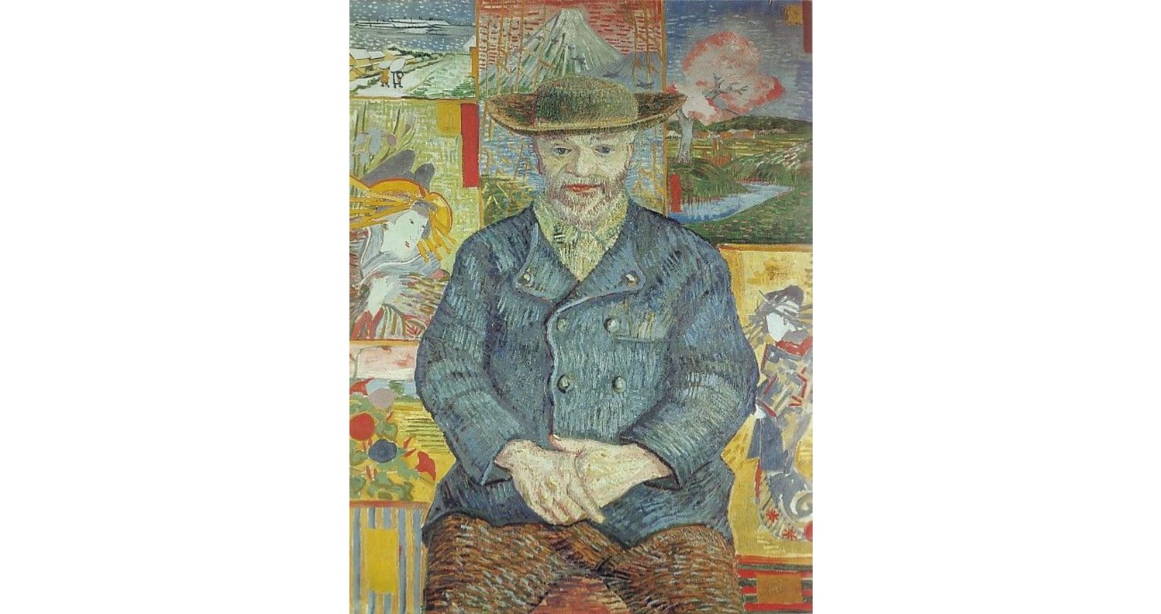 Pere Tanguy 1887 · F363
 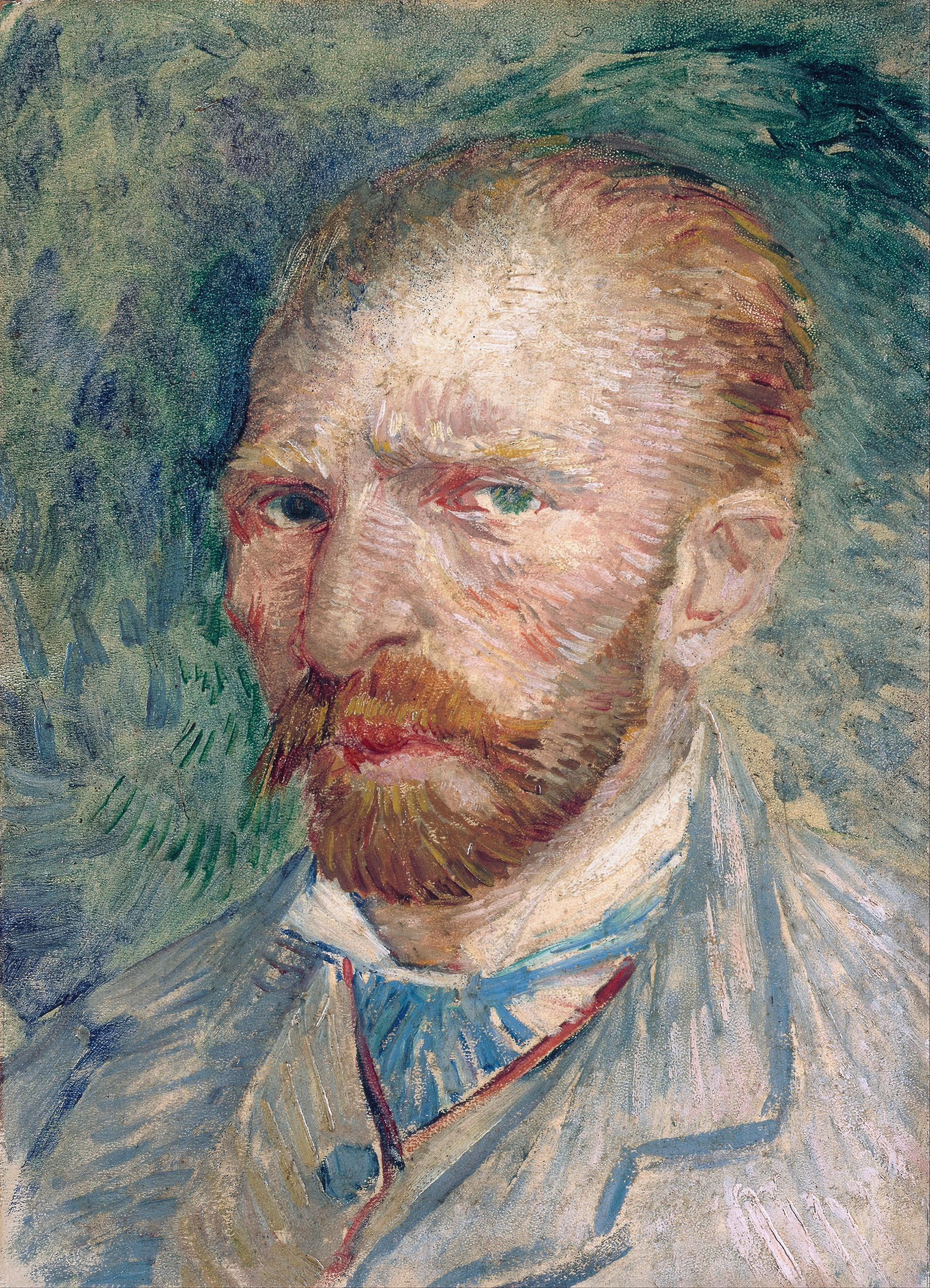 Self-Portrait 1887 · F380
 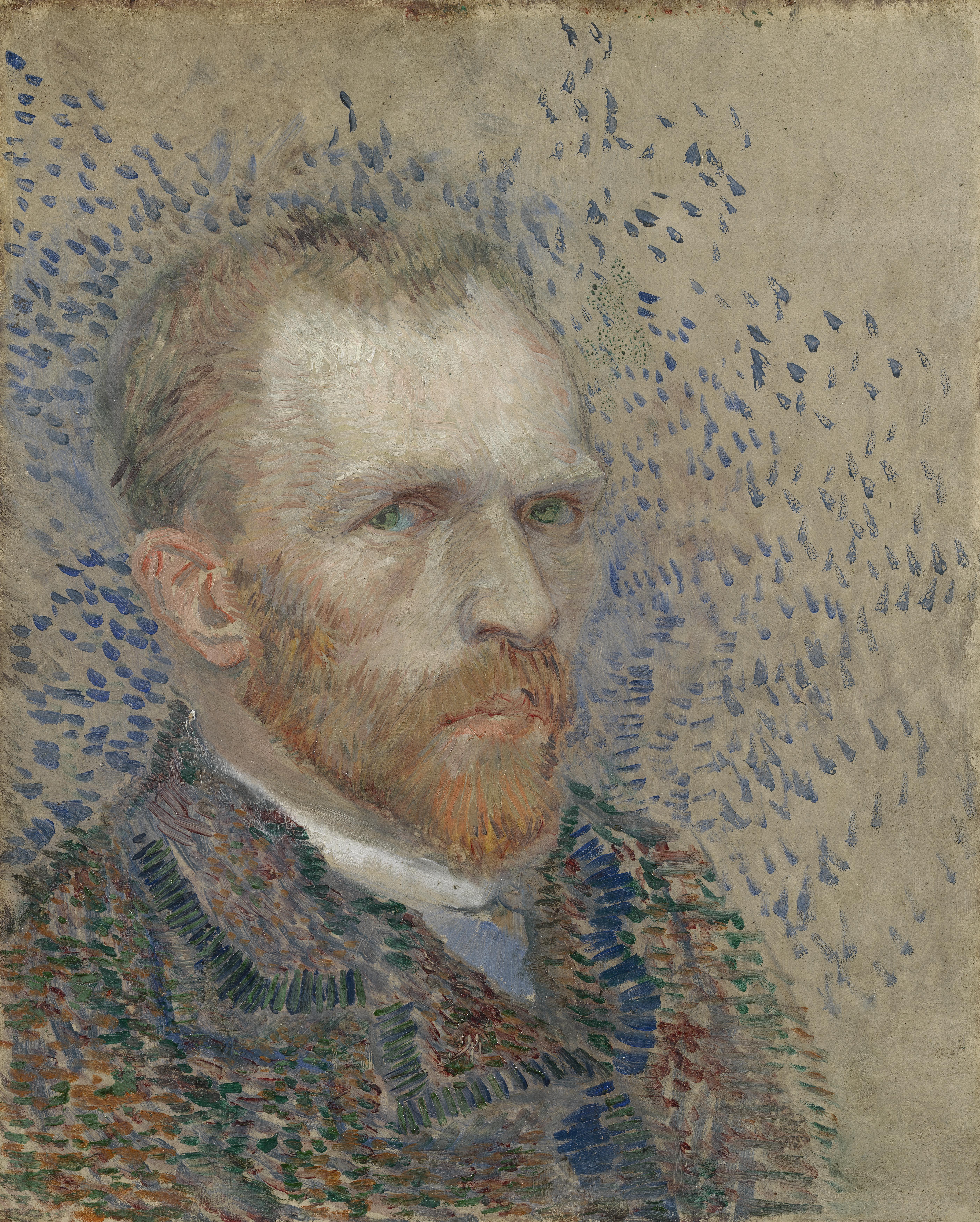 Self-Portrait with Blue Background 1887 · F356
 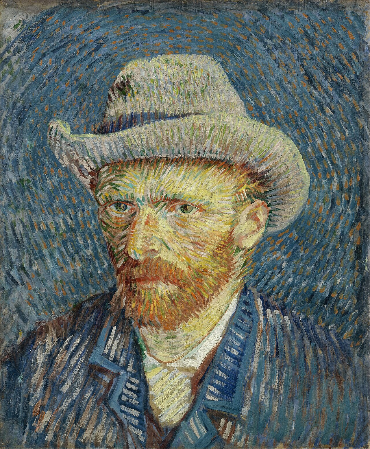 Self-Portrait with Grey Felt Hat 1887 · F344
 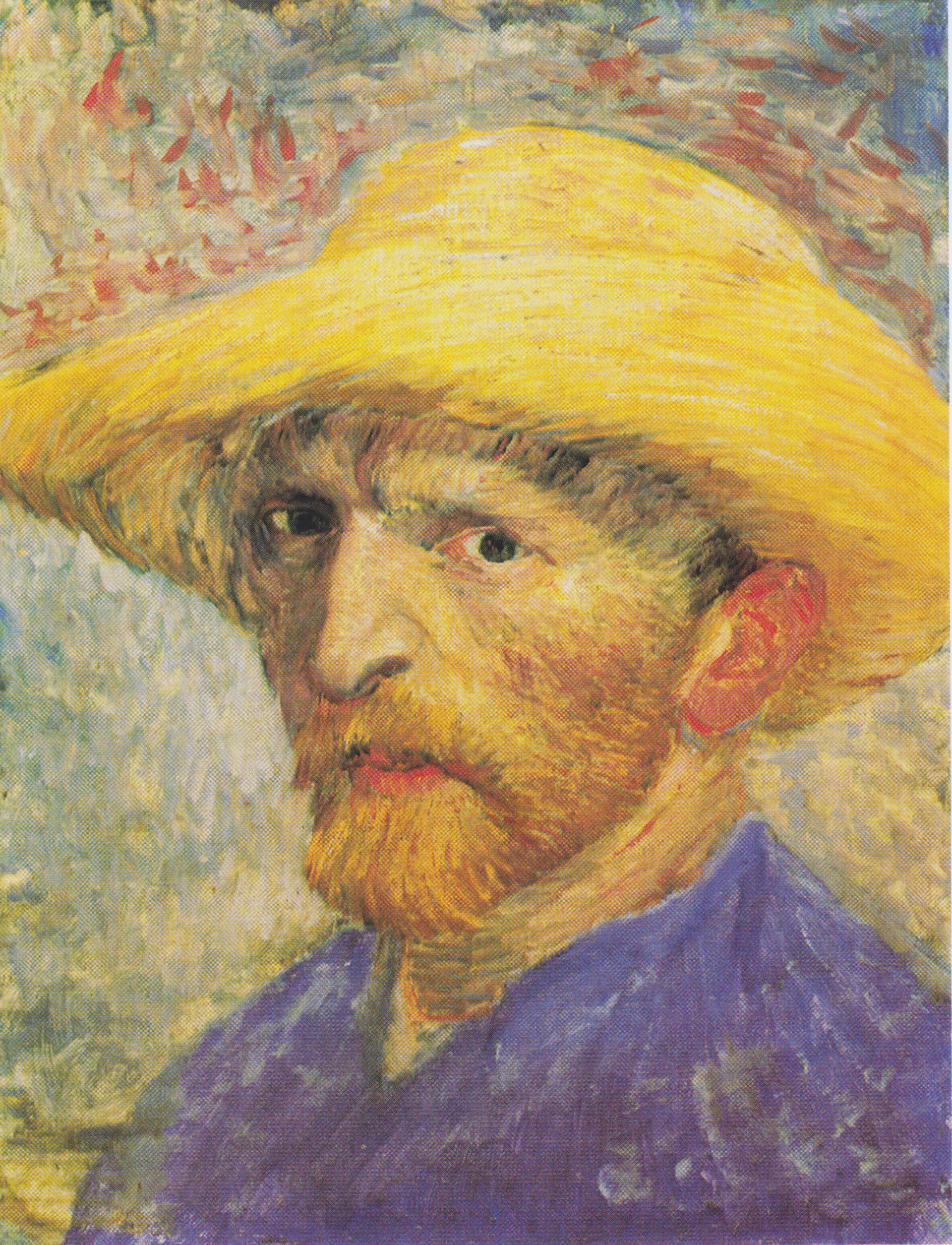 Self-Portrait with Straw Hat 1887 · F526
 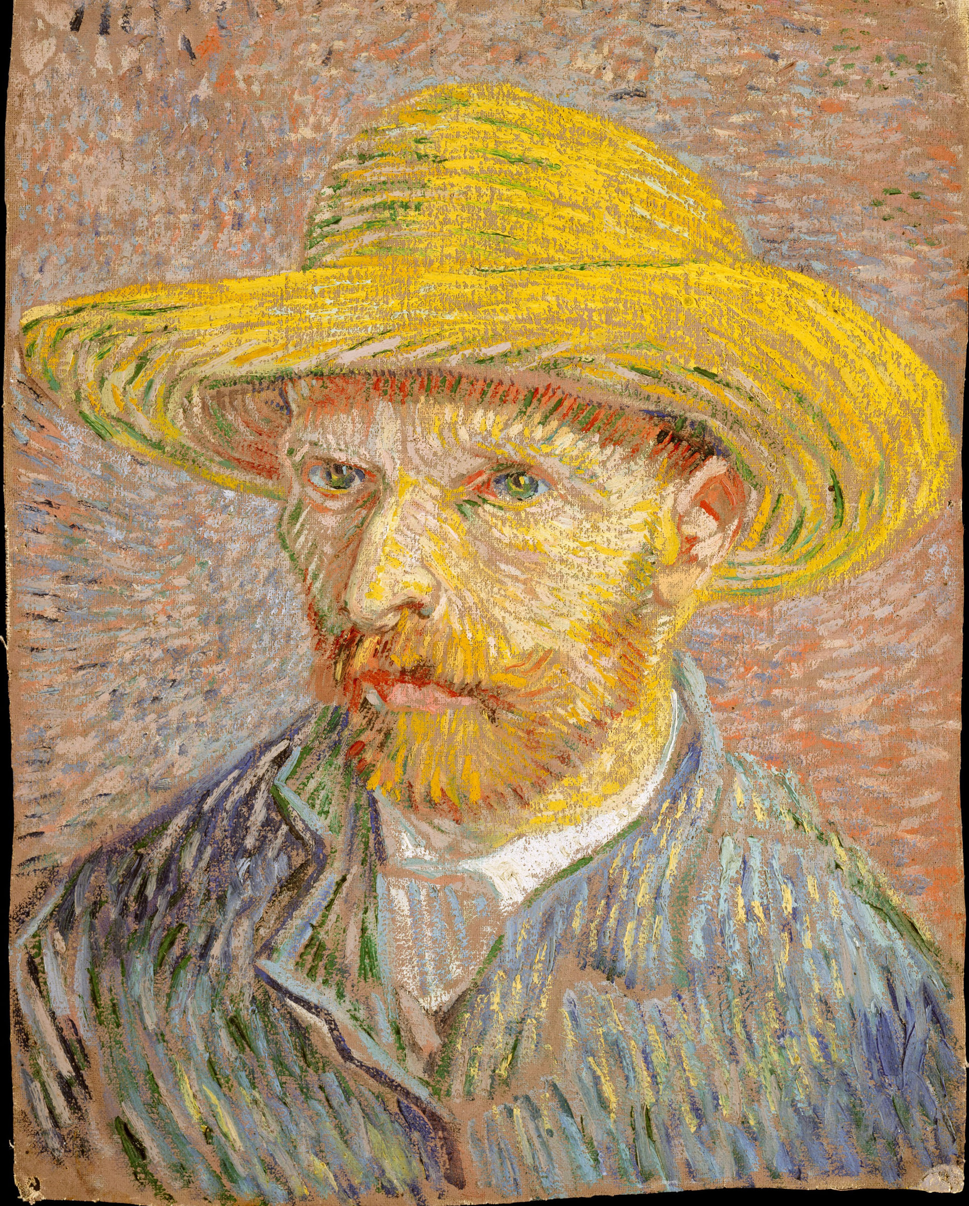 Self-Portrait with Straw Hat 1887 · F365v
 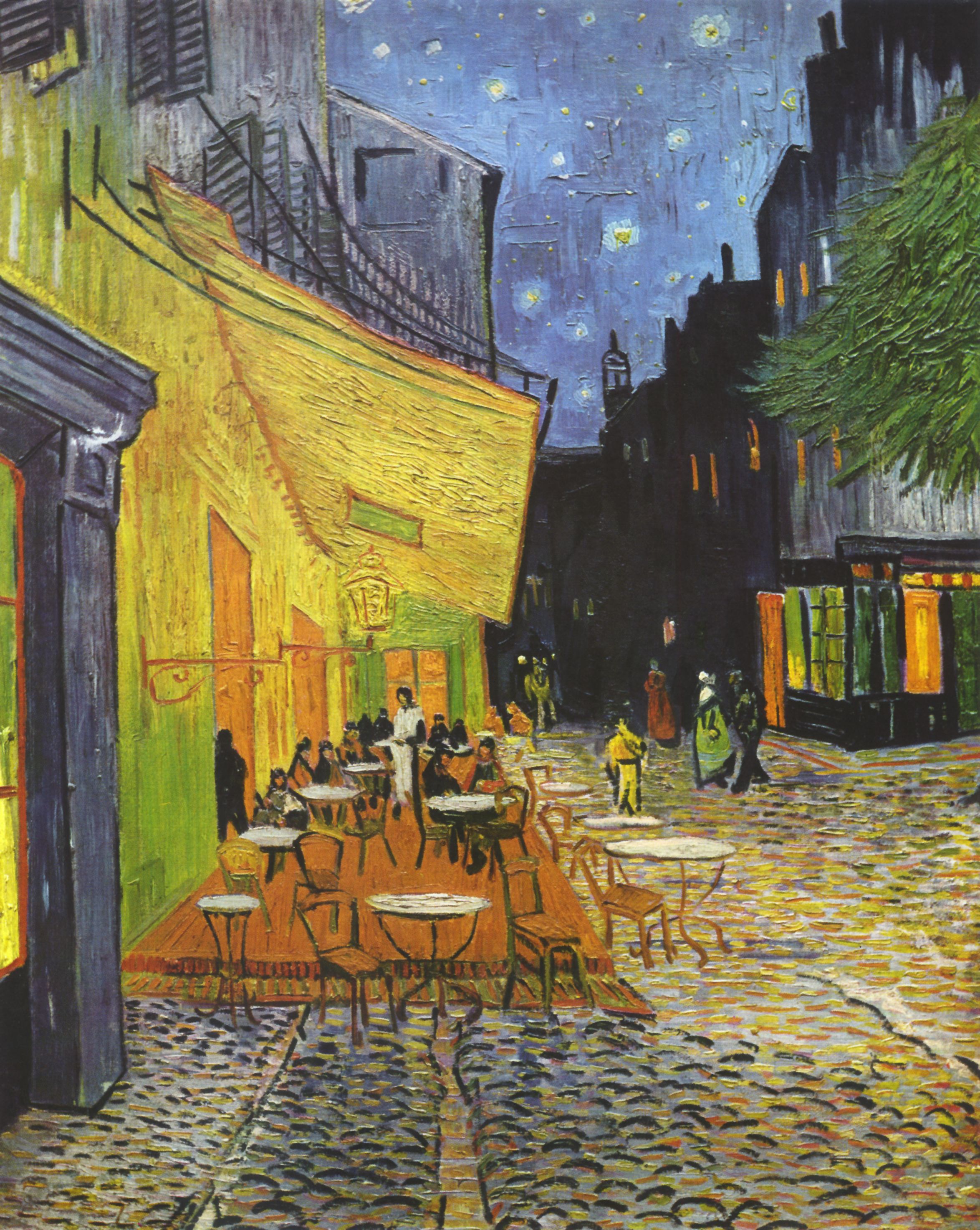 Café Terrace at Night 1888 · F467
 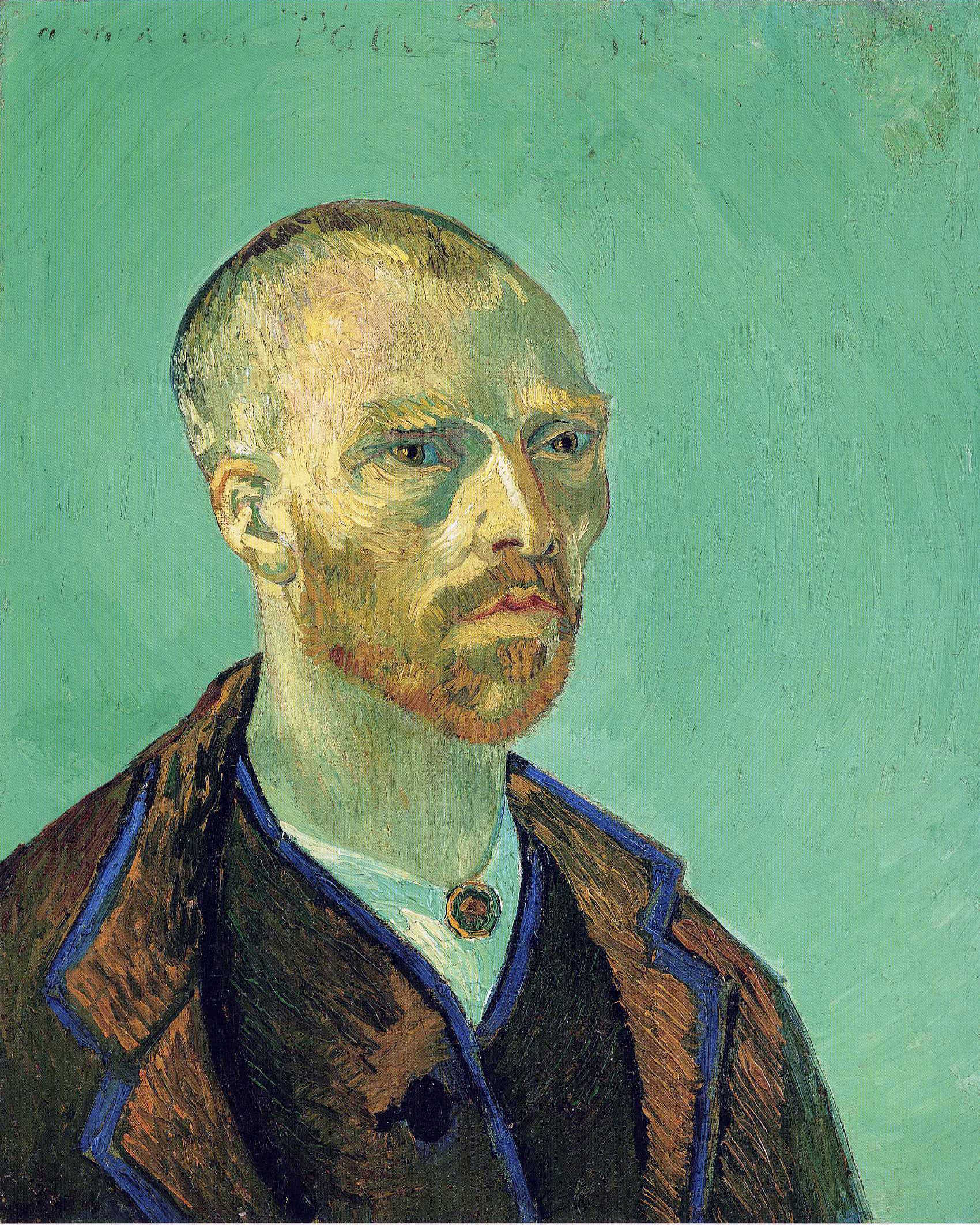 Self-Portrait (dedicated to Gauguin) 1888 · F476
 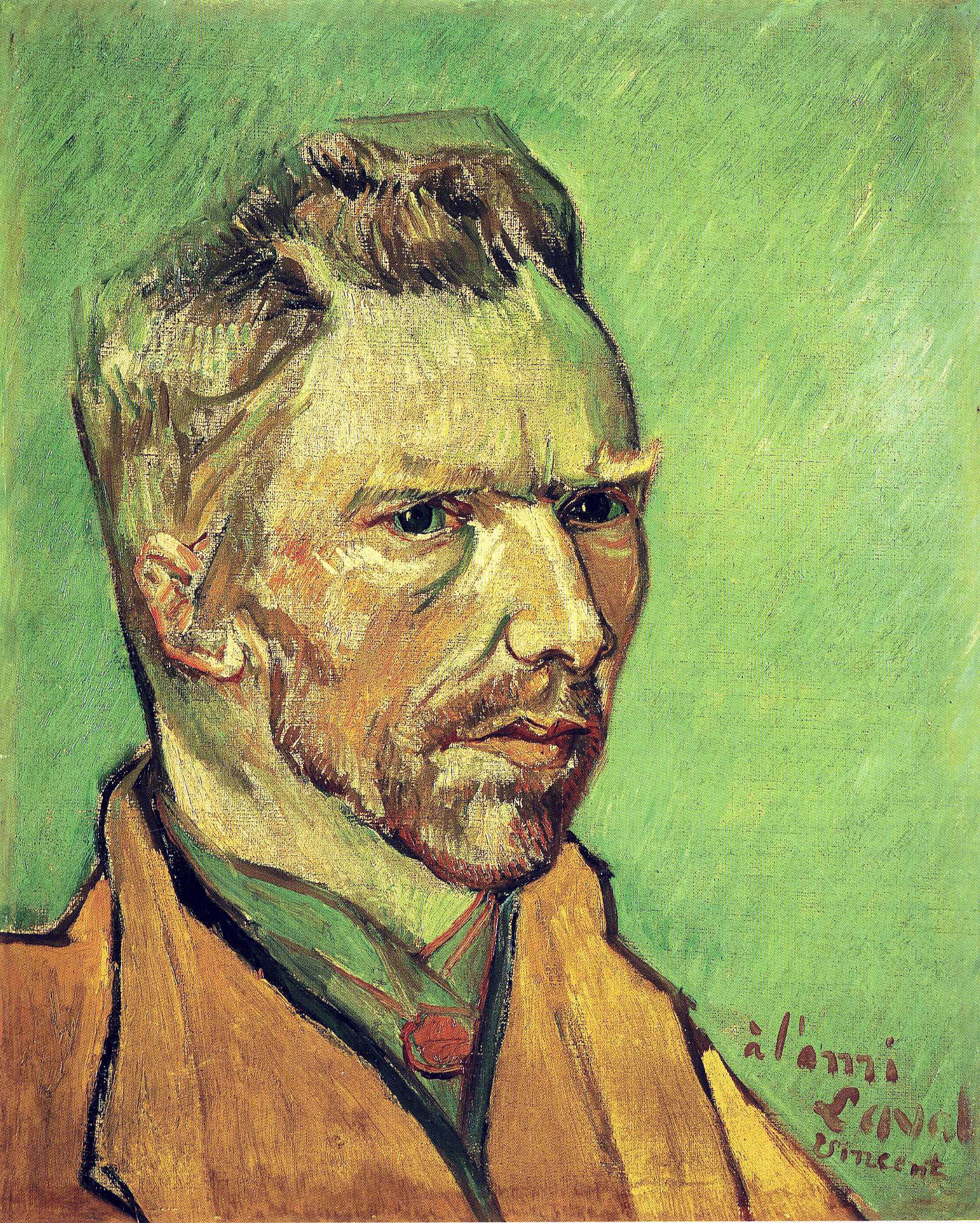 Self-Portrait Dedicated to Charles Laval 1888 · F501
 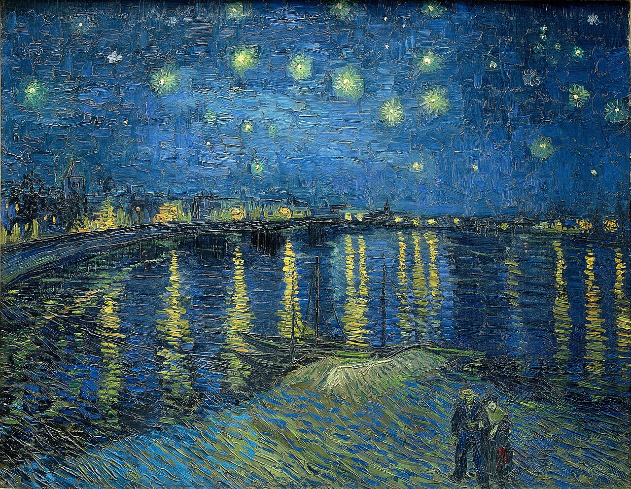 Starry Night over the Rhône 1888 · F474
 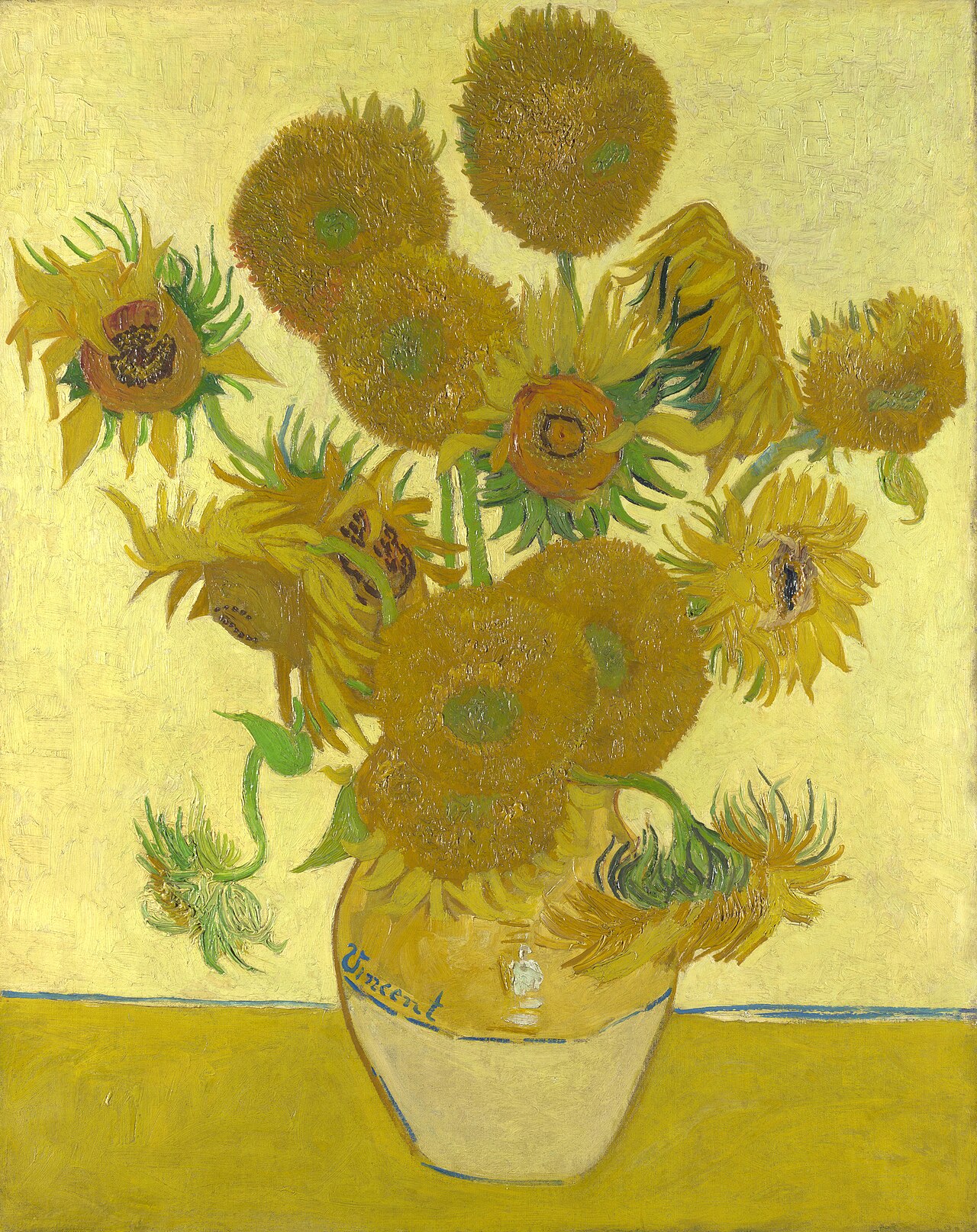 Sunflowers (fifteen) 1888 · F454
 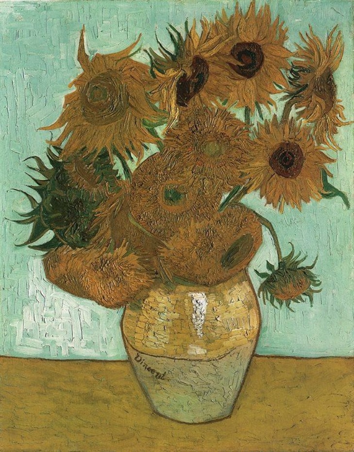 Sunflowers (twelve) 1888 · F456
 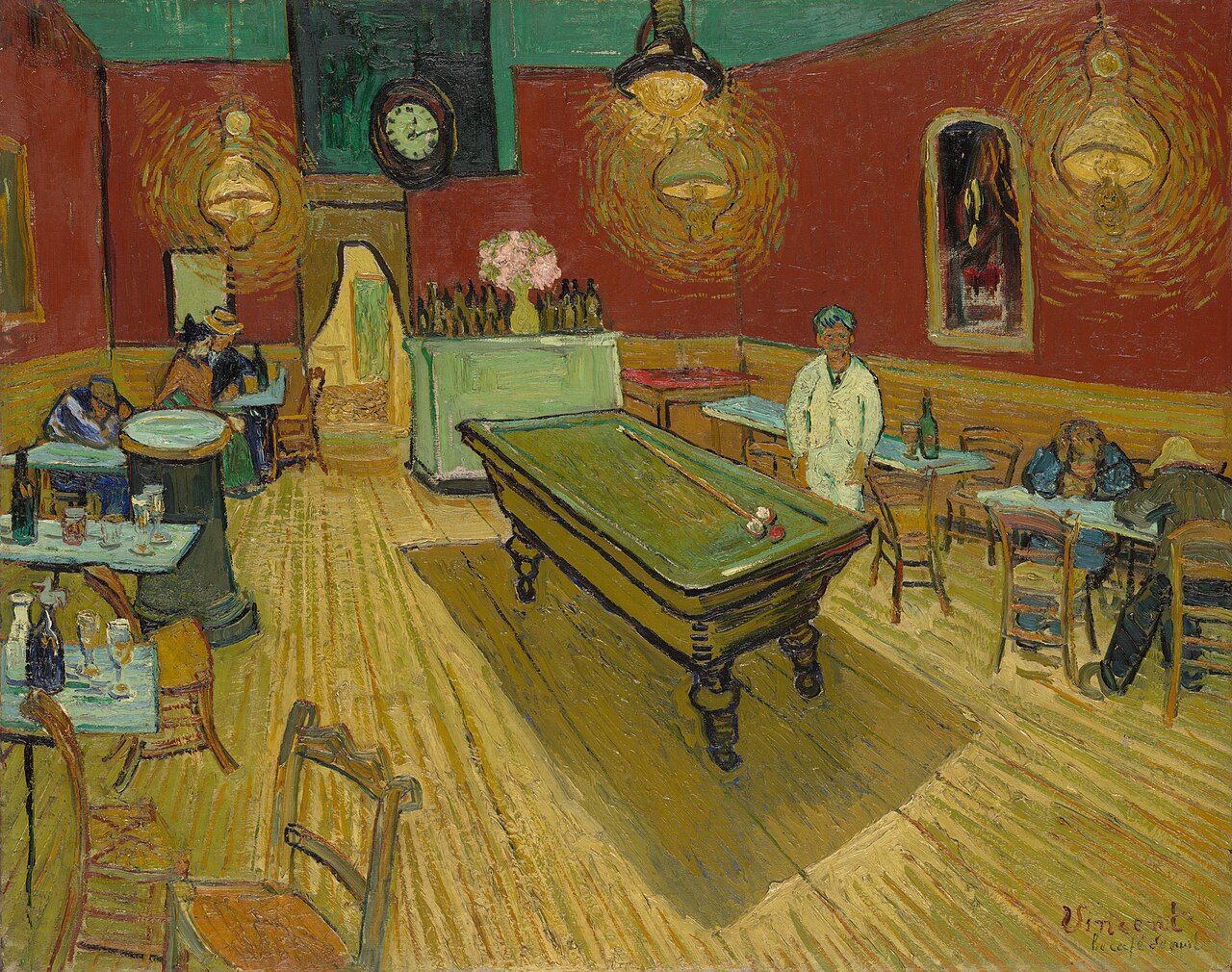 The Night Café 1888 · F463
 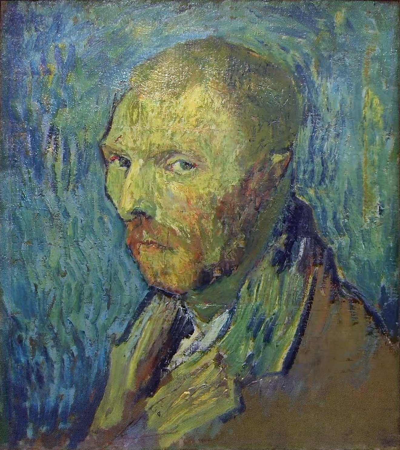 Self-Portrait (Saint-Rémy, blue swirls) 1889 · F528
 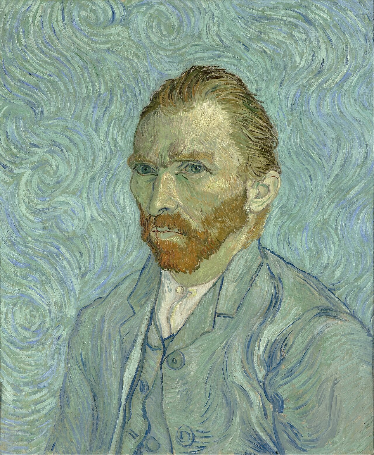 Self-Portrait (Saint-Rémy) 1889 · F627
 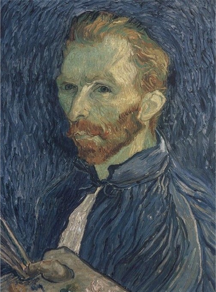 Self-Portrait with Palette 1889 · F626
 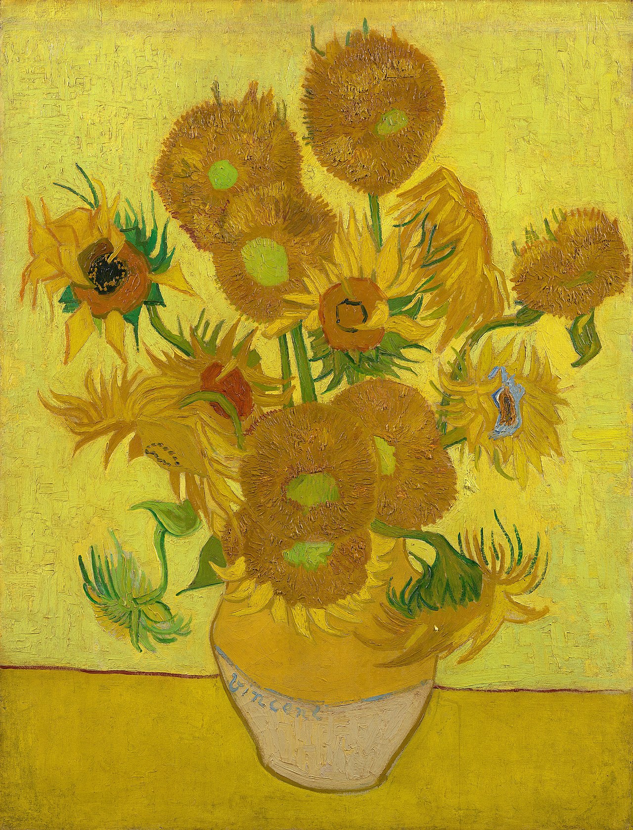 Sunflowers (fifteen, repetition) 1889 · F458